The label's catalog, online and alive.
Digital design for one of the largest record labels in the world. Artist pages, campaign microsites, and label infrastructure for a catalog spanning rock, metal, hip-hop, and pop across every era.
A catalog spanning
every genre and era.
WB's roster spanned decades and genres: Finnish gothic rock to Seattle grunge, classic hip-hop to industrial metal. Each artist's digital presence felt native to their world while sharing label infrastructure.
The brief wasn't a label website.
The brief was a system for individual worlds.
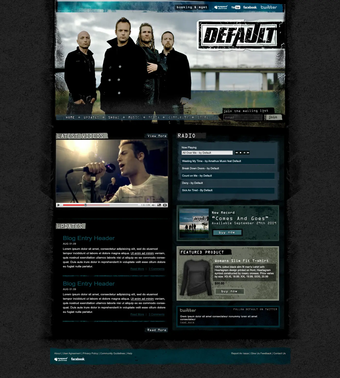
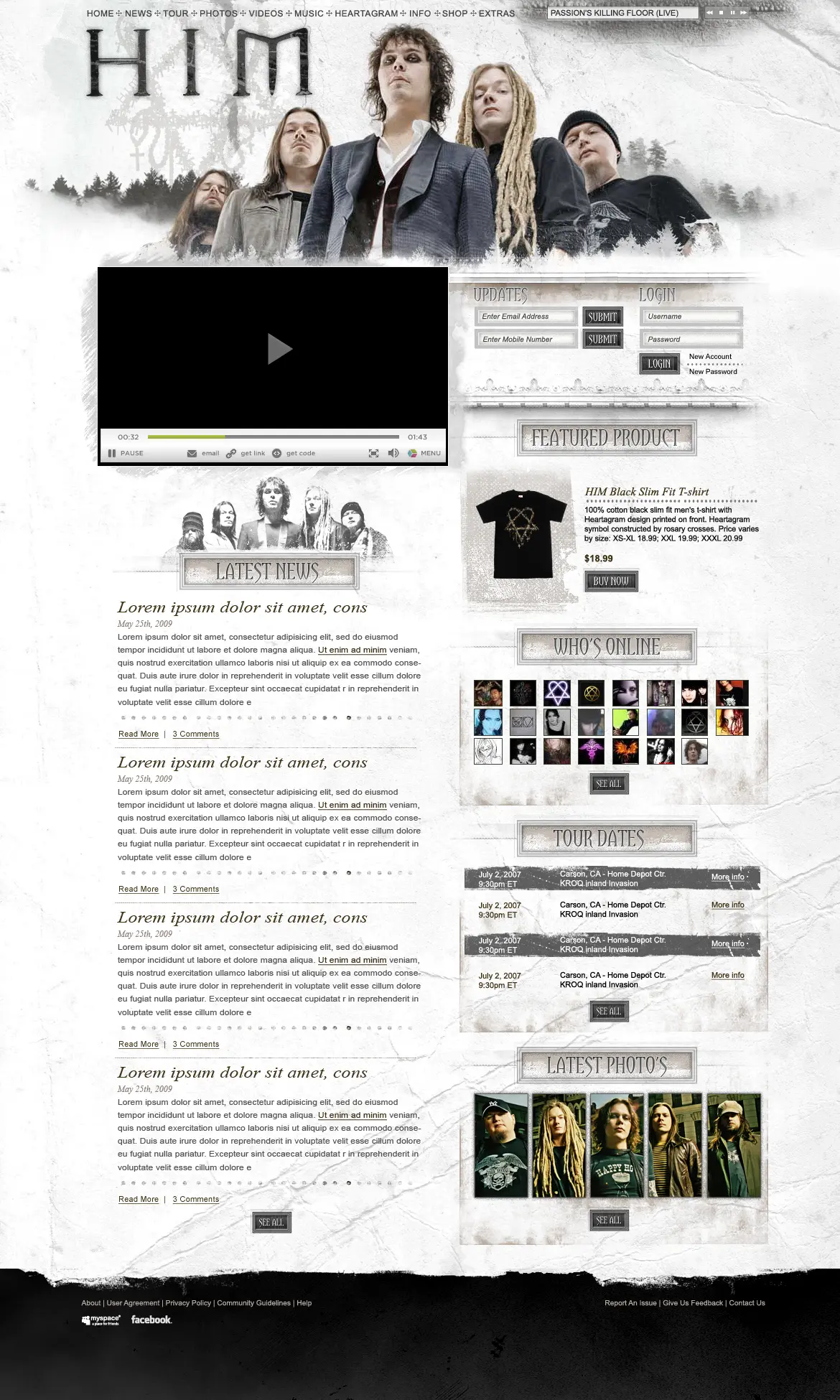
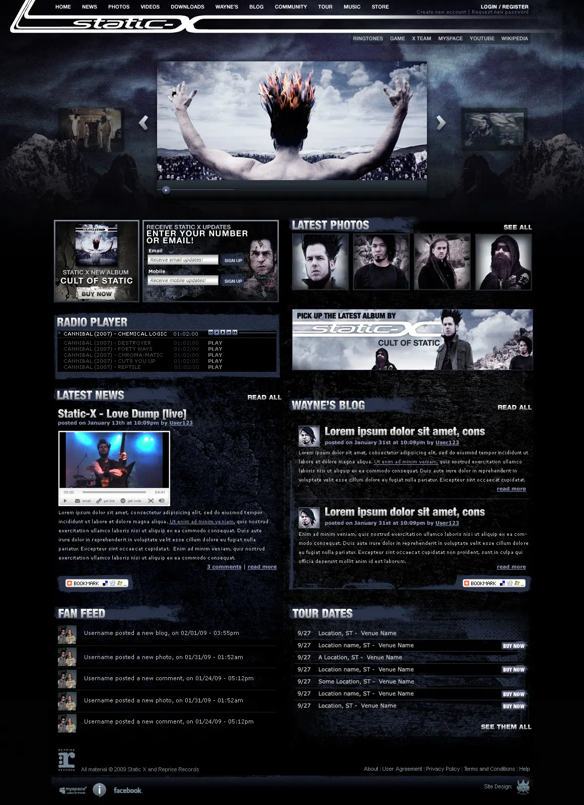
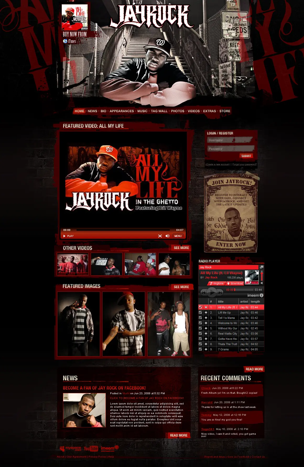
HIM and Static-X live in completely different sonic and visual universes. Jay Rock and P.O.D. carry different cultural weights. But they share the same release machine, the same tour promotion, the same fan base infrastructure.
Challenge: artist-level digital that felt handcrafted, bespoke art direction and tone, without custom building each time.
We designed a flexible label digital system: shared structural bones, artist-specific visual skins that could push as far as the artist's brand demanded without breaking the underlying template.
Label infrastructure,
artist-first design.
A digital system that let each Warner Bros. Records artist own their visual world without requiring a ground-up build, shared bones, bespoke surface, release-ready at label speed.
Each artist's world,
one shared engine.
Artist website design with a flexible visual skin system, type, color, photography treatment, and layout tension specific to each act, built on shared structural components so new artists onboarded without a full bespoke build.
Album campaign
in the artist's register.
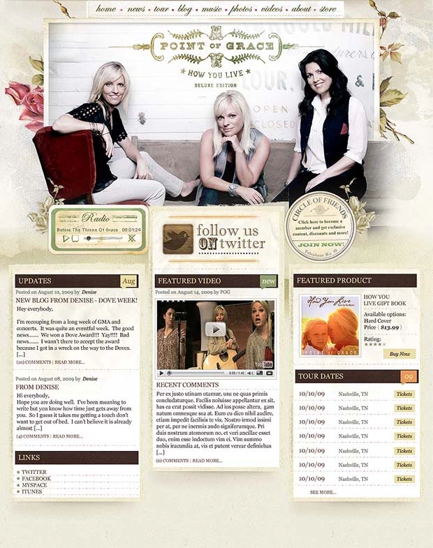
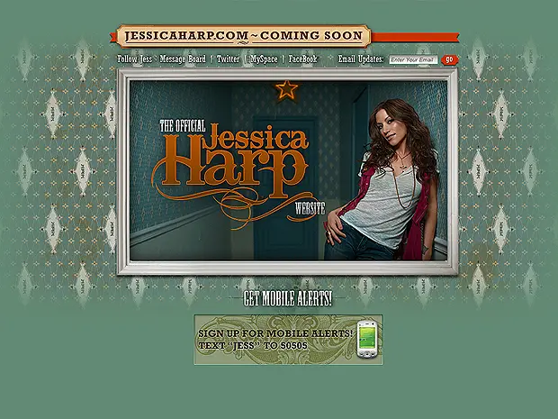
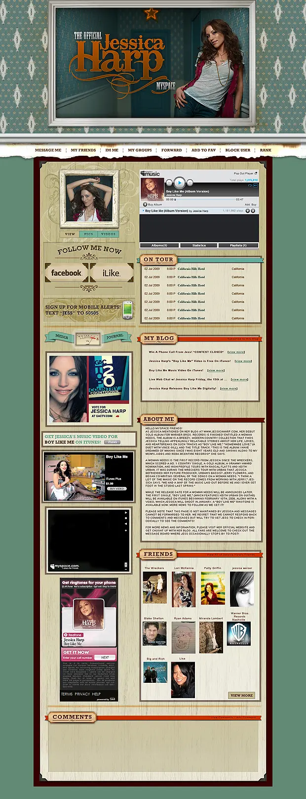
Launch microsites for new releases designed to live in the artist's world, not the label's, immersive, album-specific environments built for the campaign window and the fan audience that already knew what it was getting into.
Rock to hip-hop,
same design discipline.
The catalog demanded visual fluency across genres, the atmospheric gothic of HIM, the aggressive industrial of Static-X, the West Coast hip-hop of Jay Rock, the Christian rock of P.O.D. Each world different. The design language consistent underneath.
Release-ready
at label velocity.
Templates and production systems that let the label's team spin up new release pages, tour promotion, and artist updates without agency turnaround on every asset.
The artist's world
is the brief.
Not the label's brand guidelines.
Music taught us
to design for worlds, not pages.
Music industry digital work taught a specific discipline: the fan already has a deep relationship with the artist's world before they land on the page. You're not introducing them, you're deepening what they already feel.
Design has to earn
that already knowing.
Music audiences are the most sophisticated judges of brand authenticity there are. They know when a band's website was built by someone who doesn't listen to the band. The design has to operate from inside the world.
We bring the same depth of engagement to every client brand, the goal is always to earn the trust of the audience that already cares, not just to catch the attention of people who don't.