
Urgency triggers anxiety. Action requires belief.
UX strategy and platform architecture for a climate solutions organization. The brief was to convert urgency into action. The design problem was proving that something could actually be done.
Climate platforms design
for the wrong emotion.
Most climate platforms use alarming imagery and high-contrast crisis colors. Intuitive. But behavioral research shows audiences exposed to sustained problem-framing alone disengage. Urgency without agency becomes paralyzing.
The problem wasn't low awareness.
The problem was low belief that anything could change.
Grounded's previous site had credible content and a clear mission. Content engagement was low. Webinar registrations were minimal. The platform was not architected to move people from aware to engaged. Every update required developer support. The platform could not grow at the speed the mission demanded.
Research showed audiences exposed to problem-framing paired with solution-framing showed measurably higher intent to act. Acknowledgment of the crisis is necessary. But it has to be immediately followed by evidence that solutions exist and that the user has a role in them.
The content team needed independence. They needed to publish new solutions, update events, add solutionist profiles, and add new research without developer support every time. The CMS could not grow. Neither could the impact.
Build for sustained
attention and agency.
Three strategic shifts: restructure editorial to pair every crisis fact with a solution story. Build a visual system that enables focus instead of triggering threat. Create a CMS that lets the content team ship independently.
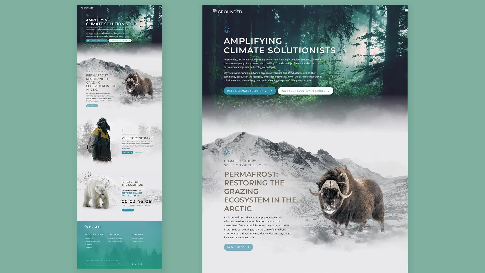
Crisis data paired
with solution stories.
Every research finding. Every climate metric. Immediately followed by a corresponding solution story at the component level. Problem acknowledgment is necessary. But it has to be followed by evidence that solutions exist and that the reader has a role in them.
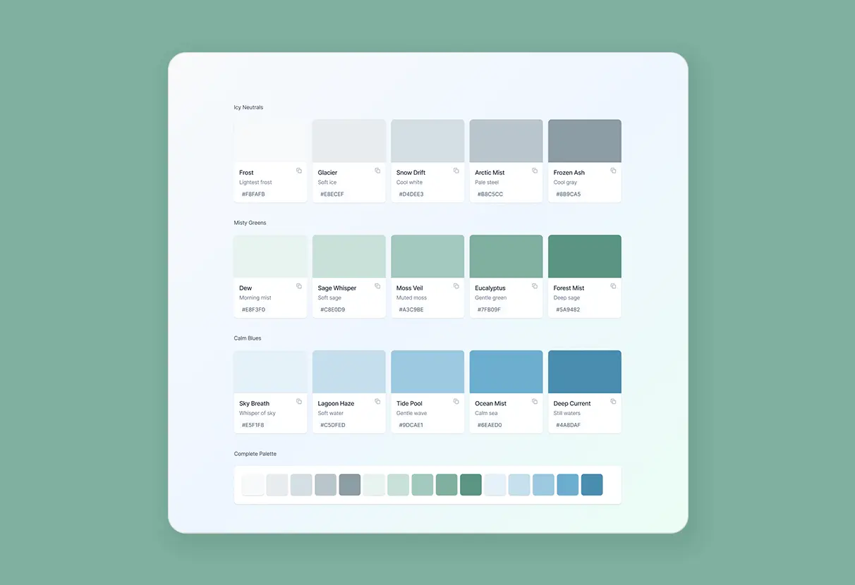
Calm colors
for sustained focus.
Color system built from Arctic photography (icy neutrals), old-growth forests (misty greens), and open water (calm blues). High-contrast crisis colors deliberately excluded at the system level. Not to minimize urgency. To remove visual activation that works against sustained attention and action-taking.
Endurance over
destruction.
Image selection prioritized intact ecosystems, field researchers, collaboration and discovery. Convey persistence and presence rather than threat. Parallax fades and slow scroll animations created unhurried depth instead of urgency. The visual experience itself reinforces that something can be done.
Modular components
for self-service publishing.
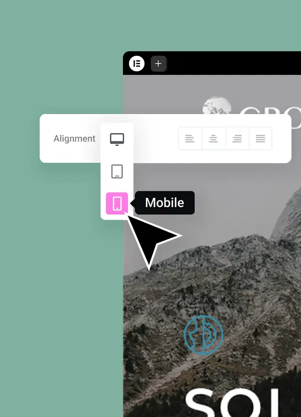
Custom WordPress modules handled live events, featured solutionists, research findings. All without developer involvement. Navigation used a three-level hierarchy with consistent iconography, allowing users to move through climate topics at their own pace. Content team self-managing updates within two weeks of handoff.
The backyard
was always terrifying.
We just made it visible.
Premise-first
is how games get played.
Game marketing is the purest form of the brief: you have seconds to communicate a world complex enough to spend hundreds of hours inside. The Grounded campaign sharpened our instinct for premise over feature copy.
in three seconds,
the trailer doesn't help.
Gaming is the most competitive creative category in entertainment marketing, new releases every week, every one competing for the same 30 seconds of attention. The creative has to land the world before it asks for the download.
We carry the same instinct into brand and product campaigns: lead with the premise, earn the feature bullets later.