Three artists. One system. No compromises.
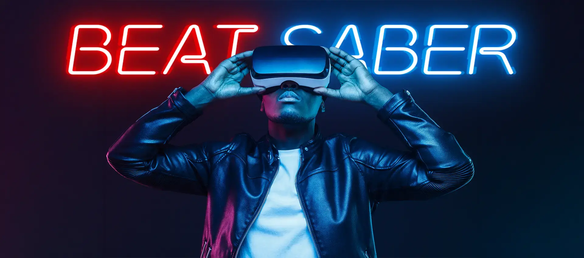
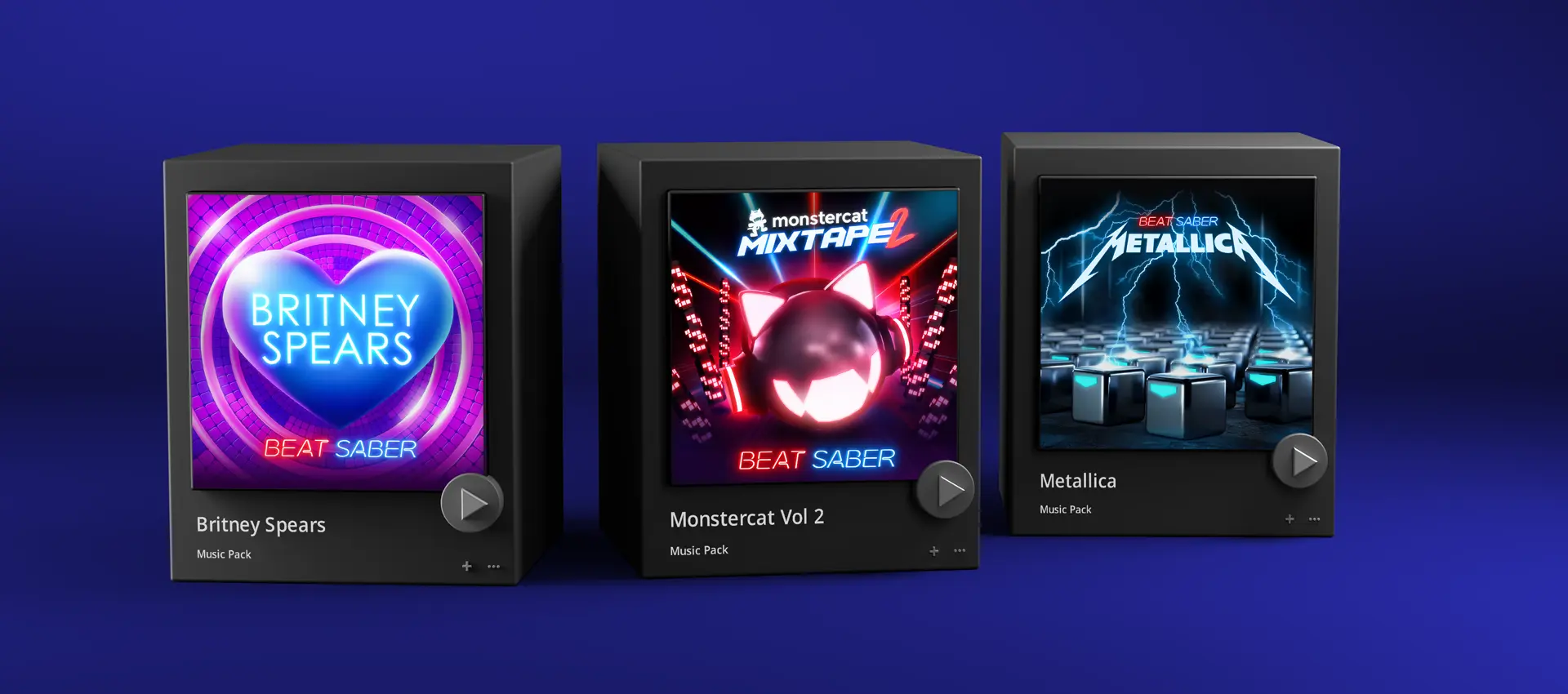
Three music packs. Three massive artists. One visual system that works in VR without breaking the game. Designed for 4 million Beat Saber players on Meta Quest.
Three fanbases.
One platform identity.
Three different artists needed one unified system. Can't fragment the game's visual identity. Can't bore existing players. The core tension: how do new fans recognize their artist while old fans still see Beat Saber?
This wasn't just art direction.
This was identity architecture.
Each pack had to feel like its own world. Strong enough that fans saw their artist. Connected enough that Beat Saber still felt like Beat Saber.
VR has real limits. Players need contrast to read the notes fast. Lighting that fights the sabers breaks the game. Overstuffed environments make people motion sick.
Everything had to work three ways: look great, match the artist, and run at 90fps. Miss one and it fails.

Three tensions.
One design system.
Framework: three competing forces. Every design decision had to satisfy all three, or die.
Artist
Authenticity
Each artist's identity had to be legible to their fans. Britney fan sees Britney. Metallica fan sees Metallica. No compromise solutions serving nobody.
Beat Saber
DNA
Fixed elements protecting platform coherence: red and blue saber colors, minimum note contrast, spatial depth. Non-negotiable across all three packs.
Gameplay
Readability
The functional floor. Spatial contrast between notes and backgrounds, lighting synced to tempo, environmental complexity that doesn't cause motion sickness. All at 90fps minimum.
- Red and blue saber color system
- Minimum note contrast ratios
- Spatial depth standards
- Motion comfort envelope
- Artist-specific color palette
- Material and texture treatment
- Environmental narrative
- Lighting choreography
Three worlds.
Built from research up.
Started with a deep dive into each artist's visual world: album art, tour design, merch, fan aesthetics. Before a single environment element was specified.
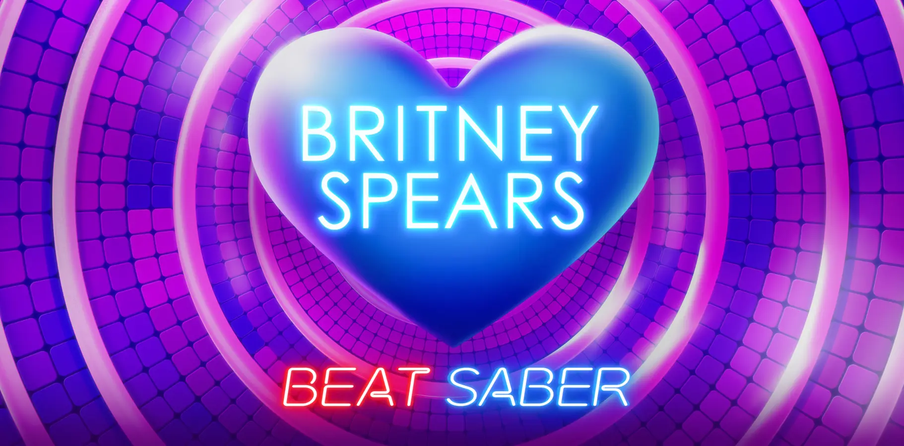
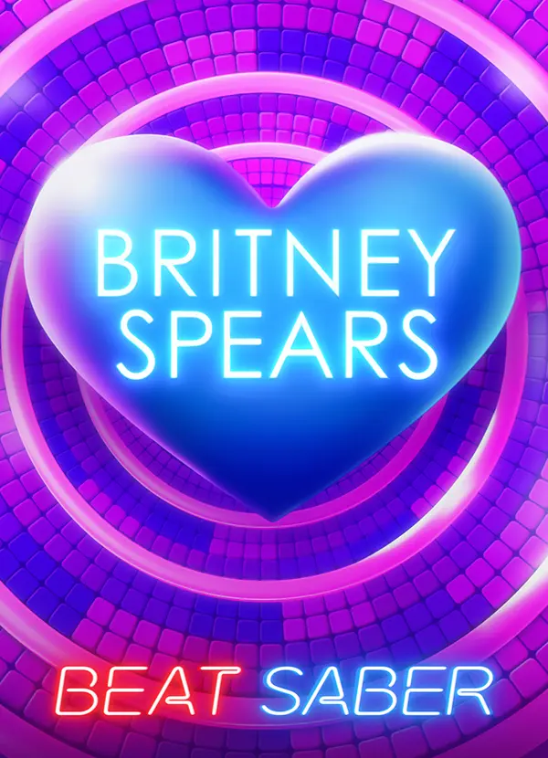
Pop Nostalgia
Meets Neon Euphoria
Five years of visual research: album artwork, tour stage design, merchandise, fan community aesthetics. Findings pointed to early 2000s club culture. Tactile, emotionally warm, and immediately recognizable.
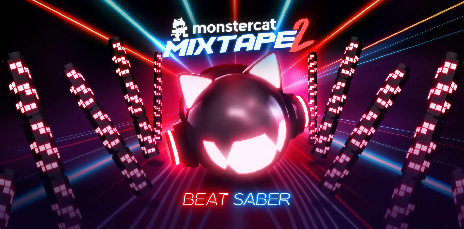
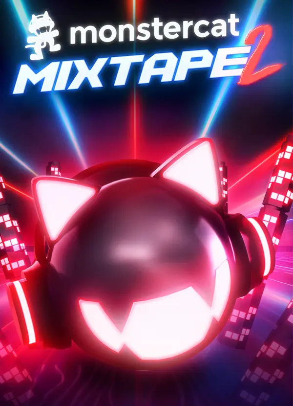
Futuristic Bass-Driven
Architecture
Monstercat's brand: kinetic evolution and genre fluidity. The challenge: translate that into spatial form. Space that behaves like sound.
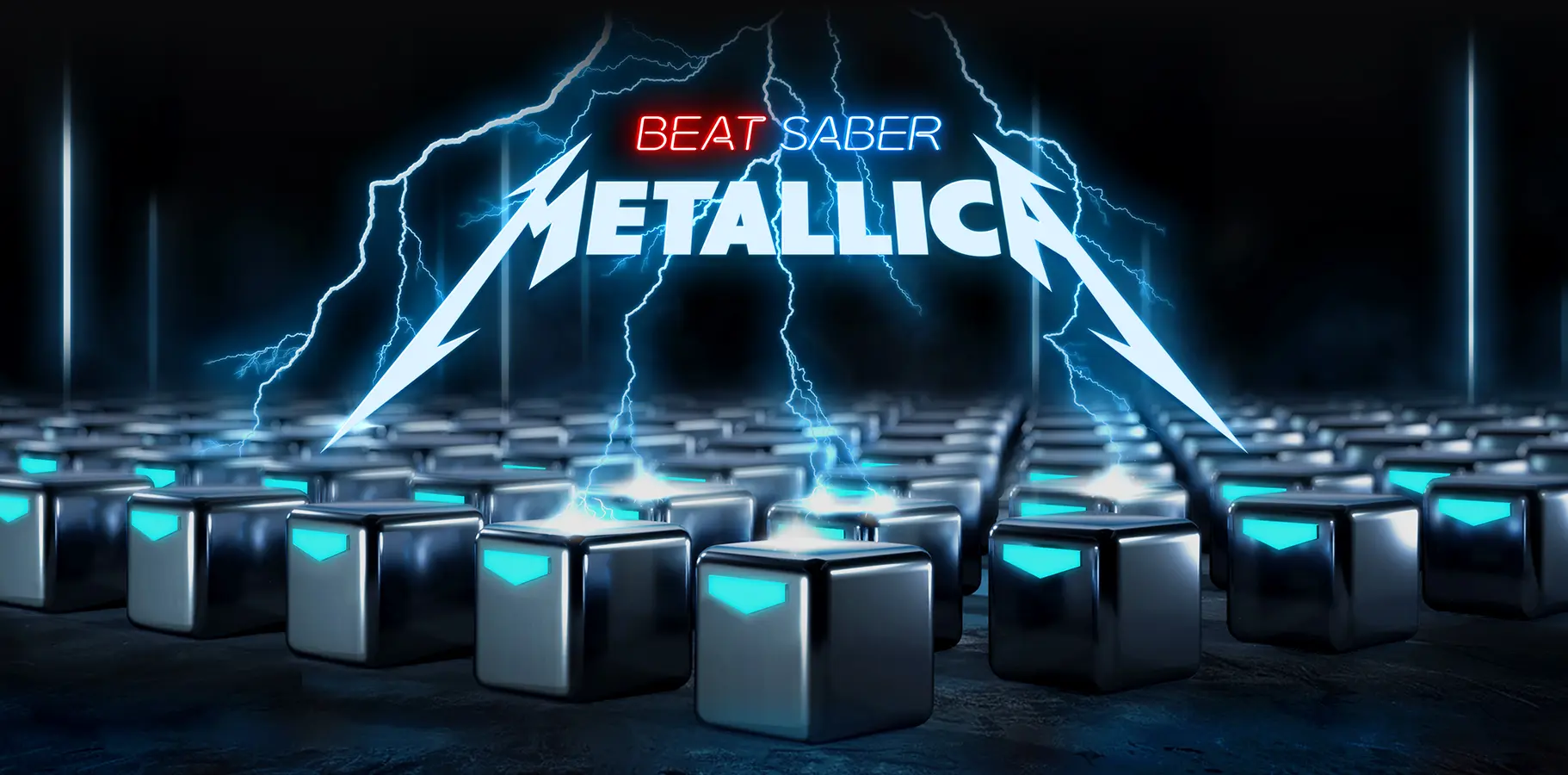
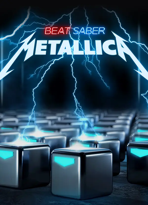
Power, Distortion,
and Thunder
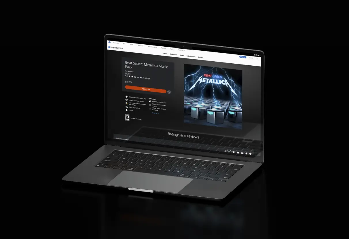
Metallica's first VR gaming entry. Design had to serve longtime metal fans and Beat Saber players equally. No compromise solutions.
I would push for
in-headset prototype reviews.
Earlier in the process.
Functional aesthetics
on every surface.
VR enforced discipline: every aesthetic decision must serve a functional purpose, or it dies. The framework (artist authenticity, platform DNA, gameplay readability) now applies to every multi-stakeholder system.
also breaks the game,
it isn't the most beautiful choice.
The engagement produced a reusable framework that Beat Games adopted for all future pack releases. Scalable component library means future packs don't start from scratch.
More broadly, it validated the principle of functional aesthetics. The constraint doesn't weaken the creative. It focuses it. The best work from this engagement was made because of the 90fps requirement, not despite it.