
The brand was keeping
users awake.
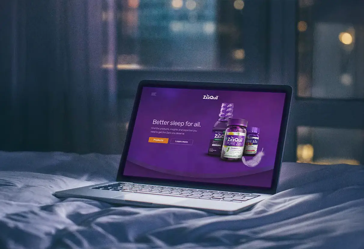
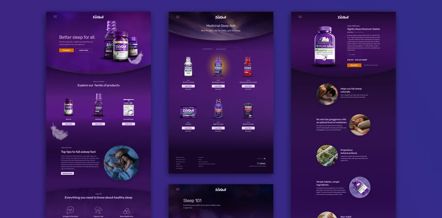
UX strategy and design system for ZzzQuil's native mobile app and e-commerce site for Procter and Gamble. The brand's bold purple packaging sells on shelves but causes eye strain in the dark bedroom where the app actually gets used.
The packaging sells it.
The packaging breaks it.
ZzzQuil's vibrant purple optimized for retail shelf visibility—commands attention at point of purchase. Applied to a mobile screen in a dark bedroom at 10pm? Eye strain and visual stimulation. Opposite of what sleep needs.
High-contrast purple. Saturated. Energetic. Stops shoppers mid-aisle, communicates premium. Optimized for fluorescent light and crowded shelves.
Dark bedroom. Phone brightness at minimum. User is already winding down. High-contrast purple creates stimulation and eye strain — the physiological opposite of preparing for sleep.
14 wellness apps.
One consistent pattern.
An audit of 14 comparable wellness and sleep apps revealed a consistent industry pattern before any design decisions were made: the best-performing apps expressed their brand through photography and illustration while keeping the UI itself neutral, low-saturation, and low-stimulation. Brand in the content. Not in the interface.
The solution wasn't inverting the colors.
It was rebuilding the system from scratch.
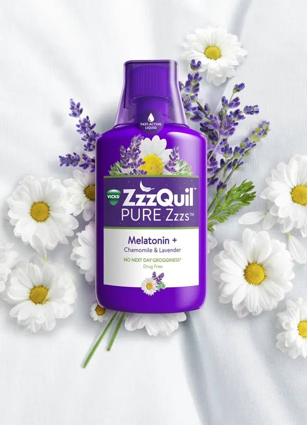
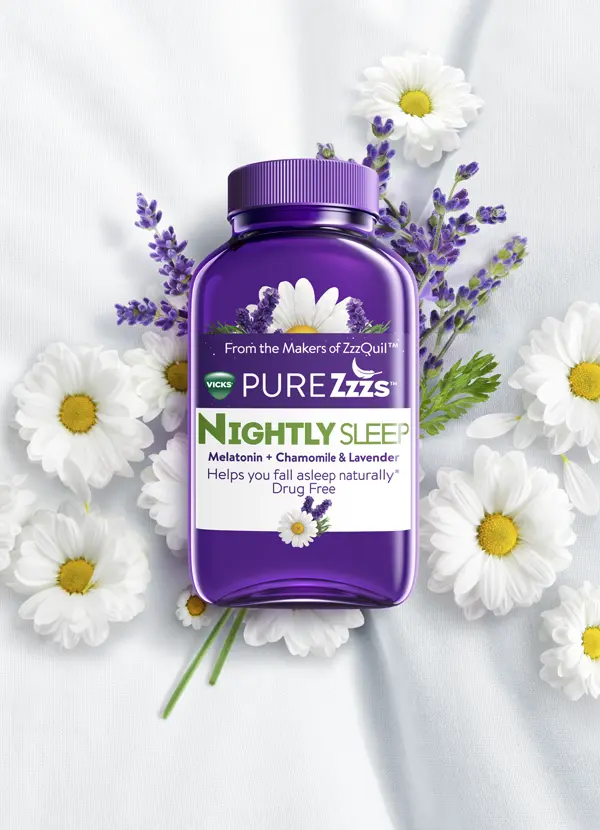
Rather than applying a dark mode filter over the existing palette, the color system was rebuilt from base saturation values — rebalancing ZzzQuil's purple for screen viewing while maintaining brand recognition and bedtime comfort. The same hue. A fundamentally different system.
User journey mapping identified the critical handoff moments as design priorities: the post-purchase app download path, where a new customer first encounters the app after buying the product, and the replenishment path, where the app needs to drive a re-purchase without breaking the sleep routine.
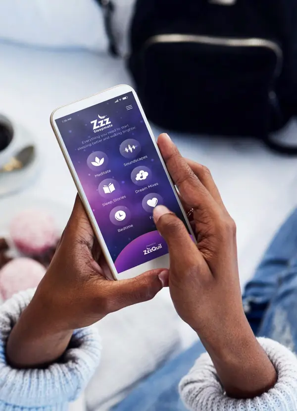
The app required complex feature delivery — meditations, soundscapes, sleep stories, scheduling, sleep insights — without creating cognitive friction during the pre-sleep moment the app exists to serve.
Brand in the content.
Calm in the interface.
A color system built for bedtime, a navigation that recedes as content loads, a bedtime clock that abstracts complexity, and a cross-platform system that maintains coherence from the app store to the checkout page.
Rebuilt from
base saturation values.
The purple palette was rebuilt from its base saturation values rather than inverted. The result: a system comfortable for late-night use that still reads as ZzzQuil — brand coherence without stimulation.
Navigation that
gets out of the way.
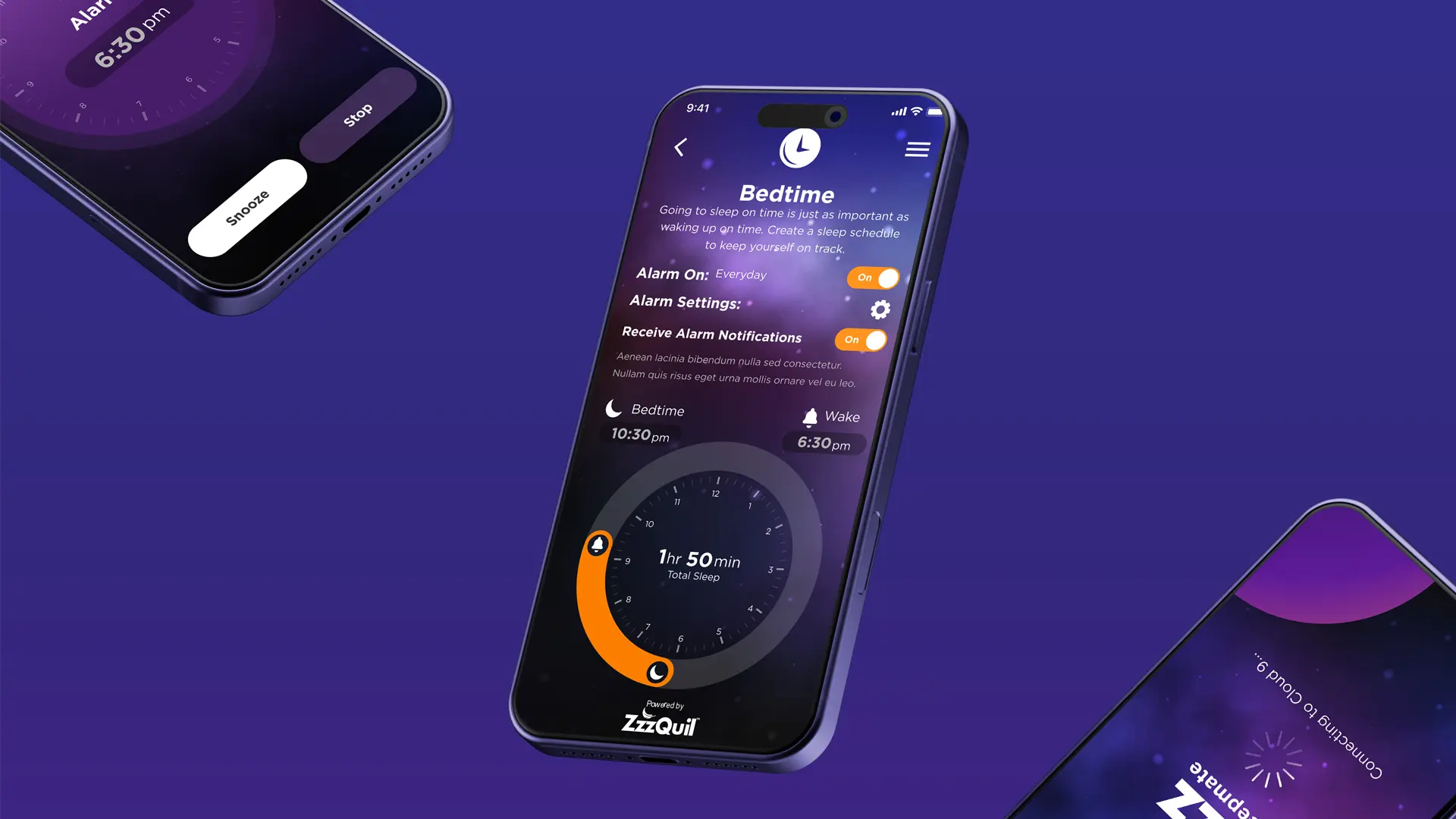
Navigation recedes as users access content. During sleep preparation, the interface itself should not demand attention. The soundscape mixer — with independent volume controls — became the most-used feature within 30 days of launch.
Complex scheduling.
Simple interface.
A visual clock interface with automatic sleep duration calculation abstracted the complexity of sleep scheduling — wake time, sleep goal, alarm buffer — into a single interaction without requiring the user to do math at bedtime.
App to e-comm.
Seamless handoff.
A unified design system ensuring visual and experiential coherence across iOS, Android, and responsive web — particularly the post-purchase download path and replenishment flow where app and e-commerce intersect.
soundscape mixer #1
The brand was
keeping users awake..
By design.
Context changes
everything.
ZzzQuil sharpened a principle that applies to every product we design: the context of use is not background information — it is a primary design constraint. The retail shelf and the bedroom are different environments with different physiological requirements. The design has to know which one it's in.
do not automatically apply
to another.
The audit of 14 wellness apps confirmed the pattern: the brands that performed best in the sleep space separated brand expression (photography, illustration, content) from interface design (neutral, low-saturation, low-cognitive-load). The brand lives in the content. The interface gets out of the way.
We apply the same distinction across every product engagement: what communicates the brand, and what enables the task. Those are different layers, and they follow different rules.